Would adding a no replies tab help? So it only shows topics with no replies?
The search bar can allow you to find content in the way ou describe.
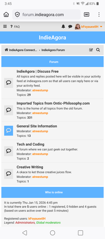
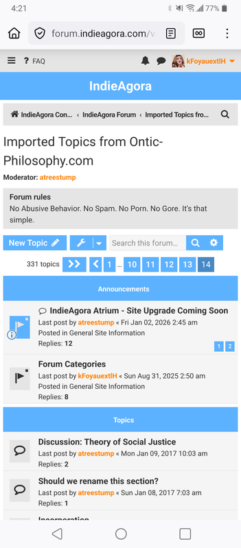
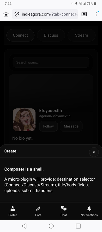
Atrium is live!
Moderator: atreestump
-
kFoyauextlH

- Posts: 1983
- Joined: Sun Jun 15, 2025 3:53 pm
Re: Atrium is live!
The no replies idea is pretty good, it might end up allowing more titles to be listed at once on the screen. I'll upload here how it looks to me using the forum site:
Upon typing "f" or unecessarily more letters without noticing that f was sufficient, I'm quickly given the link to this, then I click the Imported section usually
https://i.postimg.cc/GtZgzb33/1000143827.png
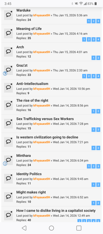
Then I find where I'd like to post, usually very quickly with just a brief glance, sometimes a scroll, other times exploring the first few pages, usually limited to the first 3, but sometimes going further to find very old unused topics to try to resurrect if I think they might touch on themes and ideas that are related or add to whatever I may be trying to get at with my latest collecting.
https://i.postimg.cc/Y0JD8t2p/1000143828.png
So it shows me around half of what is available on the screen, then the other half if I scroll past everything shown first, so it involves very few clicks and very brief scanning for the desired title to catch the eye.
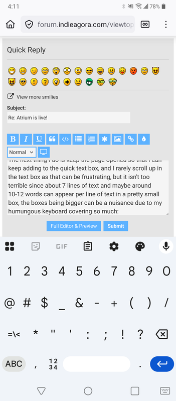
The next thing I do is keep the page opened so that I can keep adding to the quick text box, and I rarely scroll up in the text box as that can be frustrating, but it isn't too terrible since about 7 lines of text and maybe around 10-12 words can appear per line of text in a pretty small box, the boxes being bigger can be a nuisance due to my humungous keyboard covering so much:
https://i.postimg.cc/QtPrGGNg/1000143829.png
I also like how far I can click into the past if I want to explore more deeply:
https://i.postimg.cc/fbtGcqfY/1000143830.png
https://i.postimg.cc/YSG56DzY/1000143831.png
So generally I've been having a very good time using this system to get to posting where I want very quickly, besides also finding the brighter layout easier to see things and better feeling, which may also have to do with contrast.
These days, and basically for the whole time typing here since the site re-opened, I have been typing and copying information using Chrome and then Firefox, having switched to Firefox as the dominant browser for maybe a few months now. My phone also has that screen issue which constantly keeps me tense. When I use the second screen, the box area is far smaller and the keyboard practically takes up all the space so that I can't see what I'm typing, which makes communicating through copying text like Bumblebee in the Transformers live action films a little easier.
I switch to other windows constantly to get links and highlight text to quote, and scrolling to highlight the text often hits a lot of frustrating obstacles.
I practically never use the emoticons but I've never minded their presence really or paid much attention to them, but they may be useful to represent something now:


So 20 have faces, and 4 extra are like this, still with face shapes:


I probably find the use of emoticons in or after text to be pretty irritating, especially on YouTube where total b*stards seem to abuse then after they talk about how much they love the suffering of the P people and gloat and type and crying laughing faces, so they've made already hateful emoticons even more hateful by being practically the only people I ever see using them, and using them yowards expressing how vile, putrid, and despicable they are. I don't know how they imagine that benefits their cause at all, basically I at least imagine the vast majority of the world gets increasingly radicalized towards at least privately desiring the worst for someone who mocks and gloats under and in regard to videos depicting extreme human suffering and suffering of children, which brings me to my next point. I don't think my YouTube linking is showing up as visible yet on the main site, but I'm not sure.
It isn't too big of a deal if that is the case since I post do many sometimes and they can be annoying and take up space and be difficult to load, so on other sites I would add ?feature=shared which would make them appear only as a link without a big image, a habit which I've continued to practice in case I copy paste anything elsewhere which still doesn't load the thumbnails when that addition is present.
I use the way that the links display as thumbnails as a preview and also an interactive gallery for viewing things. In the past I would sometimes collect a large amount of illustrative YouTube music, with lyrics or a video (most ideally both for the maximum symbols being presented in a way that one might be best able to catch them), which would relate to or represent themes I would be trying to add to or characters including of especially of a spiritual nature like aspects of Deity that I was trying to flesh out or have the videos as a meditative aid to get thinking about those themes or that aspect.
I haven't been doing that lately, and have instead been posting YouTube videos that also might tend to annoy me, but which bring up something or are used as evidence or to further a discussion by bringing up some perspective even if it is not mine, and it is rarely mine ptobably as it seems do much that is online and which these people in comments and influencers ptoducing media say are always off and missing just about everything, they almost always seem oddly abnormal and that is possibly because they are trying to be different or to make what they say get attention and clicks, the exhibitionist perverts that they are. In the past, it didn't seem perhsps quite as much, or I didn't notice anyway as much, how no one eould ever say anything good or right, but it seems worse than ever now with American filth polluting the entire world with their extremist dichotomous culture war "much ado about nothing" annd "as you like it" clickbaiting sensationalist barely gonzo gossiping.
Here is an example of my usual technique:
https://en.wikipedia.org/wiki/Rosalind_(As_You_Like_It)
"
In 1905, Spenser scholar Percy Long identified Elizabeth North, the daughter of translator Thomas North, as the likely inspiration for the character Rosalinde in Edmund Spenser's Shepheardes Calendar. Long's identifcation is based partly on Spenser's explicit statement that "Rosalinde" is an anagram of this person's real name. "Rosalinde" rearranged is "Elisa Nord": Elisa being a common shortened version of Elizabeth, and Nord being French for "North". The young North was living with her powerful uncle, Roger North, 2nd Baron North, at his estate of Kirtling Tower around the time Spenser was first writing his first major poetic work and it is likely that Spenser met Elisa at festivities hosted there. Most scholars agree that As You Like It's Rosalind and Spenser's Rosalinde share a direct literary lineage, whether immediately or via Thomas Lodge's prose romance 'Rosalynde'.[2] Though there are many commonalities between the literary Rosalindes and the real-life Elisabeth North, and Thomas North's possible involvement in the Shakespearean canon has recently seen some academic support, this remains a controversial position.[3]
"
https://en.wikipedia.org/wiki/Elsa_(Frozen)
"
Attempts were made as early as 1937 by Walt Disney to adapt Hans Christian Andersen's fairy tale, "The Snow Queen", into a film. The tale focuses on two children, one named Gerda, who served as the basis for Princess Anna, and the other named Kai, who is "cursed with negativity" after his eyes are pierced with shards of glass from an enchanted mirror and is later kidnapped by the Snow Queen.[9][10] However, Disney struggled with creating a believable, multi-dimensional adaption of the fairy tale's title character,[11] who was intended to be a villain.[12] In the story, she is described as "a woman, dressed in garments of white gauze, which looked like millions of starry snow-flakes linked together. She was fair and beautiful, but made of ice—shining and glittering ice. Still she was alive and her eyes sparkled like bright stars, but there was neither peace nor rest in their glance."[11] Disney was unable to find a way to make the Snow Queen more real and eventually abandoned film plans.[11]
Several film executives later made efforts towards the project, including Paul and Gaëtan Brizzi, Dick Zondag, Glen Keane, and Dave Goetz. In 2011, director Chris Buck began work on another attempted adaption and also faced challenges with the Snow Queen character. Producer Peter Del Vecho explained that this was primarily because she was not relatable and too isolated, having no personal connections. As a result, they could not explain her motivations. After several changes were proposed, someone on the writing team suggested making the Snow Queen Anna's sister. "Once we realized that these characters could be siblings and have a relationship, everything changed," Del Vecho relayed.[11]
The Snow Queen, now given the name Elsa, continued to be cast as a villain,[13] and Disney released the following synopsis for Frozen in May 2013:
When Anna is cursed by her estranged sister, the cold-hearted Snow Queen, Anna's only hope of reversing the curse is to survive a perilous but thrilling journey across an icy and unforgiving landscape. Joined by a rugged, thrill-seeking outdoorsman, his one-antlered reindeer and a hapless snowman, Anna must race against time, conquer the elements and battle an army of menacing snowmen if she ever hopes to melt her frozen heart.[9]
Earlier manuscripts included more antagonistic actions by Elsa, such as intentionally cursing Arendelle with an eternal winter. Additionally, she is shown creating an army of snowmen similar to the original Snow Queen's army of snowflakes; the comedic character of Olaf was at the time written as a smaller snowman who was cast out by Elsa for being too unintimidating.[9][14] Within two months, however, scripts were altered to give emphasis to her lack of control over her powers.[15] Olaf was reduced to the only snowman created by Elsa, and he instead serves as a reminder of the sisters' childhood friendship.[16] In the final version, Elsa creates a single giant snow creature that Olaf nicknames "Marshmallow" to act as a guard after being branded as a monster for her powers.[15] According to director Jennifer Lee, the character ultimately became more of a composite of both Kai and the Snow Queen, enhancing her increasingly sympathetic portrayal.[10] Del Vecho added, "There are times when Elsa does villainous things but because you understand where it comes from, from this desire to defend herself, you can always relate to her."[17]
"
Elisa Nord.
"
In the Disney film adaptation, she is introduced as a princess in the fictional Scandinavian Kingdom of Arendelle
"
https://en.m.uesp.net/wiki/Lore:Nord
https://elderscrolls.fandom.com/wiki/Nords
So I click off of here, find a window to use in Firefox, type something in the address bar which takes me to Google. The likks don't copy paste nicely from the Google Search page, so I have to click the link and then I verify if it has what I want and if I want to place it first, and then I go up to the address bar and copy the link and return to this box which has hopefully saved my text and place and paste the link or the quote with " at the top and bottom of the text because sometimes the text itself might begin or end with a " so I out mine on top and under to differentiate it and create an impression of a window of text. In the case of this Nord stuff, I decided the first link I clicked would be the second, so the easiest way was to just click back and go to the other link that I wanted first and to copy paste that, since accessing my clipboard of copied text or earlier copied text has been difficult to access and sometimes disabled on this extremely glitchy and somehow organically changing google keyboard. Recently it has been doing another thing, maybe exclusively on this site, where it pops up and keeps going capital and not capital in the ketboard and not letting me click anything until it stops having a seizure and then finally I can click something, but it is often not even the correct thing that ends up being clicked. On the other forum site that is private it started doing a thing where it would just disappear convenently and an ad would often be behind it so that in mid typing I'd end up at Walmart or looking at a lawnmower suddenly.
I'm using the new site, the main site, to type this. So it even has a lot of scrolling and loading involved on any page with a lot of posts. Certain things were not loading or not seeming to do anything when I clicked.
Navigating to the particular thread I may want is still a bit of an uncomfortable process, as well as navigation in general, but everything looks impressive and moves quickly and smoothly.
I'm going to see how putting up links goes.
https://i.postimg.cc/x8SCQ3ZB/1000143950.png
https://i.postimg.cc/yxzdKy5H/1000143949.png
https://i.postimg.cc/RhzFmL84/1000143947.png
https://i.postimg.cc/cCNHWBjy/1000143945.jpg
https://i.postimg.cc/1XZtSrTx/1000143942.jpg
https://i.postimg.cc/zv1BNFM5/1000143913.jpg
https://i.postimg.cc/C5V10sth/1000143832.jpg
https://i.postimg.cc/2yf6Y7JC/1000143866.png
https://i.postimg.cc/Vvc6wWTY/1000143948.jpg
Ok, so one of the unfun things is how I get back to typing, since it would take me right to the end of the text box, then I'd have to carefully click the edge of the text and text box since there was little space in between to get the cursor there, then it would being up my huge keyboard and move it above the text box, then I'd have to scroll down or drag down to put it back where I can see the text box. For some reason those issues haven't occurred on the forum site, so it may have to do with sizes and how things are positioned. I'm using the phone still, on Firefox for this testing and practice. The good news is that the text didn't disappear in all those many moments if going off this page to another and back. I'm going to see what happens if I accidentally click out of this box into the darkened area of text underneath and behind it. First I'll click the space to the left of "+ Add attachment" then the gray part under the reddish or brownish red or reddish brown part, and then the shadowed area. Then I'll leave entirely by clicking a button and see if this text comes back when I return.
Alright, so I did all that I mentioned and the results were that the reddish brownish red area centers the box when I click it once, clicking off nightmarishly closes the box and shows the text behind, and if one tries to post again, the prior text or the text that was in the box doesn't return, so there is a chance of accidentally clicking off into that big gap somehow or a drop of water even somehow hitting the screen there and all the text disappearing.
Now I'm going to test a YouTube link to see what it looks kike in a post here and on the other site from here, but I think that reading on either site with the narrowness might be more difficult now.
One without "?feature=shared"
One with
My screen is messed up so the guy who appears on the left with the orange color grts covered in greenishness, so the only color it shows this greenishness with is with orange, and I'm not sure how to correct that, but it isn't too big of a deal at all compared to all the other stuff that is much more of an issue.
What else? Ok, let me test copy pasting some text:
This had a lot of orange and yellow tones but only some had the green issue appear over the colors.
How do people even find these?
"
[deleted]
•
13y ago
-
/r/spaceporn
- beautiful images of space. Part of a network of subreddits dedicated to awesome pictures.
-
r/depthhub - the best in-depth submissions and discussion on Reddit.
-
r/FoodForThought - Intelligent and thought provoking commentaries on life and culture
-
r/offbeat - funny, weird, sad, strange or quirky news. Really interesting.
-
r/nottheonion - true and ridiculous stories that you'd swear were from the Onion. Similar to offbeat.
-
r/wheredidthesodago - A subreddit for ads taken out of context.
-
r/listentothis - a place to discover new music, new or overlooked artists, and occasional rare tracks and live performances.
-
r/radioreddit - subreddit for the radio reddit online streaming radio station featuring original music by thousands of redditors.
-
r/ask_politics - r/askscience for politics.
-
r/askscience - subreddit for any questions about science. Fantastic moderation.
-
r/askhistorians - subreddit for any questions about history! Winner of Best Big Community and Best Mod Team of 2012.
-
r/redditdayof - "It's a Classy TIL with a single Daily Topic."
-
r/mildlyinteresting - for things that are, well, mildly interesting. Really cool sub.
-
r/birdswitharms - self explanatory.
-
r/serendipity - awesome way to find new subreddits.
-
r/literature - pretty good discussion, much better than r/books.
-
r/readitnow - subreddit for short stories.
-
r/redditdotcom - like r/reddit.com but a little smaller.
-
r/futurology - a subreddit devoted to speculation about the future
-
r/games - fantastic gaming subreddit, much better than r/gaming.
-
r/TrueReddit - interesting articles, a throwback to "old' reddit.
-
r/woahdude - hilarious, mind blowing stuff.
-
r/dataisbeautiful - visual representations of data.
-
r/internetisbeautiful - interesting websites from across the interwebs.
-
r/chemicalreactiongifs - interesting gifs of chemical reactions.
-
r/trueaskreddit - like r/askreddit but less shitty.
-
r/theoryofreddit - great discussion about reddit.
-
r/explainlikeimfive - place to ask questions and get simple, layman-friendly answers.
-
r/crazyideas - crazy ideas!
-
And the entire SFWP network
- Beautiful pictures, really well moderated. Over 100 extremely well
moderated subreddits with 50-100 thousand subscribers each. The most
well known is r/earthporn, my favorites are r/historyporn and r/spaceporn.
You should also learn about multireddits. Here are some of my favorites:
-
Science subreddits
-
Depth subreddits
-
News subreddits
-
SFWP Network
-
Ask subreddits
Edit: here is a multi-reddit of all of the subreddits I listed above.
For more links and lists like this check out my subreddit!
Second edit: for the hundreds of you "just replying to save for later", buy yourself reddit gold! You can save comments on mobile if you have it!
Last edit: huge thank you to whoever bought me reddit gold:D
2.7K
[deleted]
•
13y ago
I read the first one as spacedicks and I instantly thought all of the subreddits are evil
733
Ub3rpwnag3
•
13y ago
r/nottheonion is pretty phenomenal I must say.
262
redpandaeater
•
13y ago
I'm glad you mentioned r/birdswitharms, but you did forget some other gems like r/onetruegod and r/dragonsfuckingcars.
EDIT: Yes, definitely r/onetruegod and not r/oneturdgod.
33
PewterCityGymLdr
•
13y ago
r/mildlyinteresting is truly a beautiful place. One of my favorites
854
[deleted]
•
13y ago
I was very underwhelmed with r/depthhub. The top comment and biggest discussion in every single thread is why that post does not belong in r/rdepthhub.
94
-
- beautiful images of space. Part of a network of subreddits dedicated to awesome pictures.
-
r/depthhub - the best in-depth submissions and discussion on Reddit.
-
r/FoodForThought - Intelligent and thought provoking commentaries on life and culture
-
r/offbeat - funny, weird, sad, strange or quirky news. Really interesting.
-
r/nottheonion - true and ridiculous stories that you'd swear were from the Onion. Similar to offbeat.
-
r/wheredidthesodago - A subreddit for ads taken out of context.
-
r/listentothis - a place to discover new music, new or overlooked artists, and occasional rare tracks and live performances.
-
r/radioreddit - subreddit for the radio reddit online streaming radio station featuring original music by thousands of redditors.
-
r/ask_politics - r/askscience for politics.
-
r/askscience - subreddit for any questions about science. Fantastic moderation.
-
r/askhistorians - subreddit for any questions about history! Winner of Best Big Community and Best Mod Team of 2012.
-
r/redditdayof - "It's a Classy TIL with a single Daily Topic."
-
r/mildlyinteresting - for things that are, well, mildly interesting. Really cool sub.
-
r/birdswitharms - self explanatory.
-
r/serendipity - awesome way to find new subreddits.
-
r/literature - pretty good discussion, much better than r/books.
-
r/readitnow - subreddit for short stories.
-
r/redditdotcom - like r/reddit.com but a little smaller.
-
r/futurology - a subreddit devoted to speculation about the future
-
r/games - fantastic gaming subreddit, much better than r/gaming.
-
r/TrueReddit - interesting articles, a throwback to "old' reddit.
-
r/woahdude - hilarious, mind blowing stuff.
-
r/dataisbeautiful - visual representations of data.
-
r/internetisbeautiful - interesting websites from across the interwebs.
-
r/chemicalreactiongifs - interesting gifs of chemical reactions.
-
r/trueaskreddit - like r/askreddit but less shitty.
-
r/theoryofreddit - great discussion about reddit.
-
r/explainlikeimfive - place to ask questions and get simple, layman-friendly answers.
-
r/crazyideas - crazy ideas!
-
And the entire SFWP network
- Beautiful pictures, really well moderated. Over 100 extremely well
moderated subreddits with 50-100 thousand subscribers each. The most
well known is r/earthporn, my favorites are r/historyporn and r/spaceporn.
You should also learn about multireddits. Here are some of my favorites:
-
Science subreddits
-
Depth subreddits
-
News subreddits
-
SFWP Network
-
Ask subreddits
Edit: here is a multi-reddit of all of the subreddits I listed above.
For more links and lists like this check out my subreddit!
Second edit: for the hundreds of you "just replying to save for later", buy yourself reddit gold! You can save comments on mobile if you have it!
Last edit: huge thank you to whoever bought me reddit gold:D
"
I'll try to add an attachment.
Or Two
Light_and_darkness_in_ancient_Greek_myth.pdf
[ia_attachments]W3sidXJsIjoiaHR0cHM6Ly9pbmRpZWFnb3JhLmNvbS93cC1jb250ZW50L3VwbG9hZHMvMjAyNi8wMS9iYzUwMjA4ZS04M2Q1LTQzNWEtYTRhZi1mOGU4ODdkMjNlODktY29weS5qcGciLCJtaW1lIjoiaW1hZ2UvanBlZyIsImZpbGVuYW1lIjoiYmM1MDIwOGUtODNkNS00MzVhLWE0YWYtZjhlODg3ZDIzZTg5LWNvcHkuanBnIiwic2l6ZSI6MTQ5ODkxMn0seyJ1cmwiOiJodHRwczovL2luZGllYWdvcmEuY29tL3dwLWNvbnRlbnQvdXBsb2Fkcy8yMDI2LzAxL0xpZ2h0X2FuZF9kYXJrbmVzc19pbl9hbmNpZW50X0dyZWVrX215dGgucGRmIiwibWltZSI6ImFwcGxpY2F0aW9uL3BkZiIsImZpbGVuYW1lIjoiTGlnaHRfYW5kX2RhcmtuZXNzX2luX2FuY2llbnRfR3JlZWtfbXl0aC5wZGYiLCJzaXplIjoyODk5NDc0fV0=
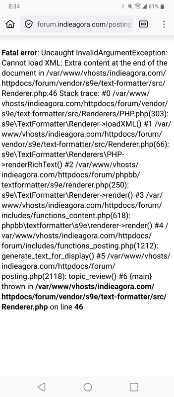
Alright, that was a very successful test here, but trying to view what I posted here on the forum site leads to this:
https://i.postimg.cc/TwnkhTkg/1000143952.png
Even though you might be moving towards mainly or entirely abandoning the old style forum site which I like and am so attached to, would it be too much of a problem to both leave it around as well as to make what is posted here viewable and compatible there, or at least to create a version that looks and acts identicle to it as a viewing option or interface that can be used and which works eith this site. At least what is typed there ends up showing here, just not the other way around yet, at least in some cases, but if there was an easy fix for that, that could continue the usefulness of that site and allow me to use either.
I would be hesitating to use this site because it makes the second page or whatever page inaccessible.
https://i.postimg.cc/TwnkhTkg/1000143952.png
So I'd probably keep using that site because I fan view it confortably there and it may also post here somewhat at least. Full compatibility woild be ideal though and I might prefer for myself at least that old style of site and navigation as it was still faster for me to get there and to where I wanted, to read, to get to posts in the middle of other posts, and to get to posting myself using the way that site displays and how it maps.
[ia_attachments]W3sidXJsIjoiaHR0cHM6Ly9pbmRpZWFnb3JhLmNvbS93cC1jb250ZW50L3VwbG9hZHMvMjAyNi8wMS9TY3JlZW5zaG90XzIwMjYwMTE3LTIwMTU1Ny5wbmciLCJtaW1lIjoiaW1hZ2UvcG5nIiwiZmlsZW5hbWUiOiJTY3JlZW5zaG90XzIwMjYwMTE3LTIwMTU1Ny5wbmciLCJzaXplIjo0NzQxMDJ9XQ==
Oh, that is a bit weird, it seemed to mix the posts so that the uploads from the earlier post shows up with a lower fown post, so that might make it confusing and I might end up avoiding using the attachment button and prefer links that stick to the other post or a certain area of a post so that something referred to from way back in the text doesn't appear at the bottom of very new and possibly different text and subject matter.
I'm going to try to add a post to this thread from the forum after these.
Added in 2 days 3 hours 21 minutes 51 seconds:
This is from the forum site. It won't let me post from the post reply box as it shows a similar, if not identicle, error to what appears when I vlick the second page now after posting in here from the main site, but now I'll see what happens when I use the first page which is still viewable due to no content from that site trying to display on this page, and the quick text box being available. I usually use the quick text box on here almost exclusively after scrolling to the bottom as my main method for posting, which is why I described in detail some site viewing and navigating processes in case it helps with designing sites based on the way I and then possibly others may tend to use them.
I'll post this link of what it shows me whrn I click post reply here on the forum site, also when I clicked the post reply just now and then took a screenshot of the error and clicked back, my text remained here as it was, which is not happening on the other site which loses the text if I click something else or try to get back, so that is something else that I like about the forum site:
https://i.postimg.cc/sxYDnGTB/1000143953.png
Added in 5 minutes :
Alright, so posting on the forum site using the quick post box heals the issue and makes the post from the other site viewable here now, eliminating the error and making navigation to the second page possible as well as using the post reply button, which I tested just now too after predicting that it would be fixed also by my posting using the forum site after the error caused by posting on the main site and trying to view it here.
If it isn't terribly difficult and time consuming to make it viewable both ways and that an error shouldn't show or require a post to be made afterwards on the forum site to make it viewable on the forum site, that might be best for me at least, as the forum site still has the edge in certain ways that make it preferable for me with the way I've recently been typing and collecting information and reading with my phone issues.
Upon typing "f" or unecessarily more letters without noticing that f was sufficient, I'm quickly given the link to this, then I click the Imported section usually
https://i.postimg.cc/GtZgzb33/1000143827.png
Then I find where I'd like to post, usually very quickly with just a brief glance, sometimes a scroll, other times exploring the first few pages, usually limited to the first 3, but sometimes going further to find very old unused topics to try to resurrect if I think they might touch on themes and ideas that are related or add to whatever I may be trying to get at with my latest collecting.
https://i.postimg.cc/Y0JD8t2p/1000143828.png
So it shows me around half of what is available on the screen, then the other half if I scroll past everything shown first, so it involves very few clicks and very brief scanning for the desired title to catch the eye.
The next thing I do is keep the page opened so that I can keep adding to the quick text box, and I rarely scroll up in the text box as that can be frustrating, but it isn't too terrible since about 7 lines of text and maybe around 10-12 words can appear per line of text in a pretty small box, the boxes being bigger can be a nuisance due to my humungous keyboard covering so much:
https://i.postimg.cc/QtPrGGNg/1000143829.png
I also like how far I can click into the past if I want to explore more deeply:
https://i.postimg.cc/fbtGcqfY/1000143830.png
https://i.postimg.cc/YSG56DzY/1000143831.png
So generally I've been having a very good time using this system to get to posting where I want very quickly, besides also finding the brighter layout easier to see things and better feeling, which may also have to do with contrast.
These days, and basically for the whole time typing here since the site re-opened, I have been typing and copying information using Chrome and then Firefox, having switched to Firefox as the dominant browser for maybe a few months now. My phone also has that screen issue which constantly keeps me tense. When I use the second screen, the box area is far smaller and the keyboard practically takes up all the space so that I can't see what I'm typing, which makes communicating through copying text like Bumblebee in the Transformers live action films a little easier.
I switch to other windows constantly to get links and highlight text to quote, and scrolling to highlight the text often hits a lot of frustrating obstacles.
I practically never use the emoticons but I've never minded their presence really or paid much attention to them, but they may be useful to represent something now:
So 20 have faces, and 4 extra are like this, still with face shapes:
I probably find the use of emoticons in or after text to be pretty irritating, especially on YouTube where total b*stards seem to abuse then after they talk about how much they love the suffering of the P people and gloat and type
It isn't too big of a deal if that is the case since I post do many sometimes and they can be annoying and take up space and be difficult to load, so on other sites I would add ?feature=shared which would make them appear only as a link without a big image, a habit which I've continued to practice in case I copy paste anything elsewhere which still doesn't load the thumbnails when that addition is present.
I use the way that the links display as thumbnails as a preview and also an interactive gallery for viewing things. In the past I would sometimes collect a large amount of illustrative YouTube music, with lyrics or a video (most ideally both for the maximum symbols being presented in a way that one might be best able to catch them), which would relate to or represent themes I would be trying to add to or characters including of especially of a spiritual nature like aspects of Deity that I was trying to flesh out or have the videos as a meditative aid to get thinking about those themes or that aspect.
I haven't been doing that lately, and have instead been posting YouTube videos that also might tend to annoy me, but which bring up something or are used as evidence or to further a discussion by bringing up some perspective even if it is not mine, and it is rarely mine ptobably as it seems do much that is online and which these people in comments and influencers ptoducing media say are always off and missing just about everything, they almost always seem oddly abnormal and that is possibly because they are trying to be different or to make what they say get attention and clicks, the exhibitionist perverts that they are. In the past, it didn't seem perhsps quite as much, or I didn't notice anyway as much, how no one eould ever say anything good or right, but it seems worse than ever now with American filth polluting the entire world with their extremist dichotomous culture war "much ado about nothing" annd "as you like it" clickbaiting sensationalist barely gonzo gossiping.
Here is an example of my usual technique:
https://en.wikipedia.org/wiki/Rosalind_(As_You_Like_It)
"
In 1905, Spenser scholar Percy Long identified Elizabeth North, the daughter of translator Thomas North, as the likely inspiration for the character Rosalinde in Edmund Spenser's Shepheardes Calendar. Long's identifcation is based partly on Spenser's explicit statement that "Rosalinde" is an anagram of this person's real name. "Rosalinde" rearranged is "Elisa Nord": Elisa being a common shortened version of Elizabeth, and Nord being French for "North". The young North was living with her powerful uncle, Roger North, 2nd Baron North, at his estate of Kirtling Tower around the time Spenser was first writing his first major poetic work and it is likely that Spenser met Elisa at festivities hosted there. Most scholars agree that As You Like It's Rosalind and Spenser's Rosalinde share a direct literary lineage, whether immediately or via Thomas Lodge's prose romance 'Rosalynde'.[2] Though there are many commonalities between the literary Rosalindes and the real-life Elisabeth North, and Thomas North's possible involvement in the Shakespearean canon has recently seen some academic support, this remains a controversial position.[3]
"
https://en.wikipedia.org/wiki/Elsa_(Frozen)
"
Attempts were made as early as 1937 by Walt Disney to adapt Hans Christian Andersen's fairy tale, "The Snow Queen", into a film. The tale focuses on two children, one named Gerda, who served as the basis for Princess Anna, and the other named Kai, who is "cursed with negativity" after his eyes are pierced with shards of glass from an enchanted mirror and is later kidnapped by the Snow Queen.[9][10] However, Disney struggled with creating a believable, multi-dimensional adaption of the fairy tale's title character,[11] who was intended to be a villain.[12] In the story, she is described as "a woman, dressed in garments of white gauze, which looked like millions of starry snow-flakes linked together. She was fair and beautiful, but made of ice—shining and glittering ice. Still she was alive and her eyes sparkled like bright stars, but there was neither peace nor rest in their glance."[11] Disney was unable to find a way to make the Snow Queen more real and eventually abandoned film plans.[11]
Several film executives later made efforts towards the project, including Paul and Gaëtan Brizzi, Dick Zondag, Glen Keane, and Dave Goetz. In 2011, director Chris Buck began work on another attempted adaption and also faced challenges with the Snow Queen character. Producer Peter Del Vecho explained that this was primarily because she was not relatable and too isolated, having no personal connections. As a result, they could not explain her motivations. After several changes were proposed, someone on the writing team suggested making the Snow Queen Anna's sister. "Once we realized that these characters could be siblings and have a relationship, everything changed," Del Vecho relayed.[11]
The Snow Queen, now given the name Elsa, continued to be cast as a villain,[13] and Disney released the following synopsis for Frozen in May 2013:
When Anna is cursed by her estranged sister, the cold-hearted Snow Queen, Anna's only hope of reversing the curse is to survive a perilous but thrilling journey across an icy and unforgiving landscape. Joined by a rugged, thrill-seeking outdoorsman, his one-antlered reindeer and a hapless snowman, Anna must race against time, conquer the elements and battle an army of menacing snowmen if she ever hopes to melt her frozen heart.[9]
Earlier manuscripts included more antagonistic actions by Elsa, such as intentionally cursing Arendelle with an eternal winter. Additionally, she is shown creating an army of snowmen similar to the original Snow Queen's army of snowflakes; the comedic character of Olaf was at the time written as a smaller snowman who was cast out by Elsa for being too unintimidating.[9][14] Within two months, however, scripts were altered to give emphasis to her lack of control over her powers.[15] Olaf was reduced to the only snowman created by Elsa, and he instead serves as a reminder of the sisters' childhood friendship.[16] In the final version, Elsa creates a single giant snow creature that Olaf nicknames "Marshmallow" to act as a guard after being branded as a monster for her powers.[15] According to director Jennifer Lee, the character ultimately became more of a composite of both Kai and the Snow Queen, enhancing her increasingly sympathetic portrayal.[10] Del Vecho added, "There are times when Elsa does villainous things but because you understand where it comes from, from this desire to defend herself, you can always relate to her."[17]
"
Elisa Nord.
"
In the Disney film adaptation, she is introduced as a princess in the fictional Scandinavian Kingdom of Arendelle
"
https://en.m.uesp.net/wiki/Lore:Nord
https://elderscrolls.fandom.com/wiki/Nords
So I click off of here, find a window to use in Firefox, type something in the address bar which takes me to Google. The likks don't copy paste nicely from the Google Search page, so I have to click the link and then I verify if it has what I want and if I want to place it first, and then I go up to the address bar and copy the link and return to this box which has hopefully saved my text and place and paste the link or the quote with " at the top and bottom of the text because sometimes the text itself might begin or end with a " so I out mine on top and under to differentiate it and create an impression of a window of text. In the case of this Nord stuff, I decided the first link I clicked would be the second, so the easiest way was to just click back and go to the other link that I wanted first and to copy paste that, since accessing my clipboard of copied text or earlier copied text has been difficult to access and sometimes disabled on this extremely glitchy and somehow organically changing google keyboard. Recently it has been doing another thing, maybe exclusively on this site, where it pops up and keeps going capital and not capital in the ketboard and not letting me click anything until it stops having a seizure and then finally I can click something, but it is often not even the correct thing that ends up being clicked. On the other forum site that is private it started doing a thing where it would just disappear convenently and an ad would often be behind it so that in mid typing I'd end up at Walmart or looking at a lawnmower suddenly.
I'm using the new site, the main site, to type this. So it even has a lot of scrolling and loading involved on any page with a lot of posts. Certain things were not loading or not seeming to do anything when I clicked.
Navigating to the particular thread I may want is still a bit of an uncomfortable process, as well as navigation in general, but everything looks impressive and moves quickly and smoothly.
I'm going to see how putting up links goes.
https://i.postimg.cc/x8SCQ3ZB/1000143950.png
https://i.postimg.cc/yxzdKy5H/1000143949.png
https://i.postimg.cc/RhzFmL84/1000143947.png
https://i.postimg.cc/cCNHWBjy/1000143945.jpg
https://i.postimg.cc/1XZtSrTx/1000143942.jpg
https://i.postimg.cc/zv1BNFM5/1000143913.jpg
https://i.postimg.cc/C5V10sth/1000143832.jpg
https://i.postimg.cc/2yf6Y7JC/1000143866.png
https://i.postimg.cc/Vvc6wWTY/1000143948.jpg
Ok, so one of the unfun things is how I get back to typing, since it would take me right to the end of the text box, then I'd have to carefully click the edge of the text and text box since there was little space in between to get the cursor there, then it would being up my huge keyboard and move it above the text box, then I'd have to scroll down or drag down to put it back where I can see the text box. For some reason those issues haven't occurred on the forum site, so it may have to do with sizes and how things are positioned. I'm using the phone still, on Firefox for this testing and practice. The good news is that the text didn't disappear in all those many moments if going off this page to another and back. I'm going to see what happens if I accidentally click out of this box into the darkened area of text underneath and behind it. First I'll click the space to the left of "+ Add attachment" then the gray part under the reddish or brownish red or reddish brown part, and then the shadowed area. Then I'll leave entirely by clicking a button and see if this text comes back when I return.
Alright, so I did all that I mentioned and the results were that the reddish brownish red area centers the box when I click it once, clicking off nightmarishly closes the box and shows the text behind, and if one tries to post again, the prior text or the text that was in the box doesn't return, so there is a chance of accidentally clicking off into that big gap somehow or a drop of water even somehow hitting the screen there and all the text disappearing.
Now I'm going to test a YouTube link to see what it looks kike in a post here and on the other site from here, but I think that reading on either site with the narrowness might be more difficult now.
One without "?feature=shared"
One with
My screen is messed up so the guy who appears on the left with the orange color grts covered in greenishness, so the only color it shows this greenishness with is with orange, and I'm not sure how to correct that, but it isn't too big of a deal at all compared to all the other stuff that is much more of an issue.
What else? Ok, let me test copy pasting some text:
This had a lot of orange and yellow tones but only some had the green issue appear over the colors.
How do people even find these?
"
[deleted]
•
13y ago
-
/r/spaceporn
- beautiful images of space. Part of a network of subreddits dedicated to awesome pictures.
-
r/depthhub - the best in-depth submissions and discussion on Reddit.
-
r/FoodForThought - Intelligent and thought provoking commentaries on life and culture
-
r/offbeat - funny, weird, sad, strange or quirky news. Really interesting.
-
r/nottheonion - true and ridiculous stories that you'd swear were from the Onion. Similar to offbeat.
-
r/wheredidthesodago - A subreddit for ads taken out of context.
-
r/listentothis - a place to discover new music, new or overlooked artists, and occasional rare tracks and live performances.
-
r/radioreddit - subreddit for the radio reddit online streaming radio station featuring original music by thousands of redditors.
-
r/ask_politics - r/askscience for politics.
-
r/askscience - subreddit for any questions about science. Fantastic moderation.
-
r/askhistorians - subreddit for any questions about history! Winner of Best Big Community and Best Mod Team of 2012.
-
r/redditdayof - "It's a Classy TIL with a single Daily Topic."
-
r/mildlyinteresting - for things that are, well, mildly interesting. Really cool sub.
-
r/birdswitharms - self explanatory.
-
r/serendipity - awesome way to find new subreddits.
-
r/literature - pretty good discussion, much better than r/books.
-
r/readitnow - subreddit for short stories.
-
r/redditdotcom - like r/reddit.com but a little smaller.
-
r/futurology - a subreddit devoted to speculation about the future
-
r/games - fantastic gaming subreddit, much better than r/gaming.
-
r/TrueReddit - interesting articles, a throwback to "old' reddit.
-
r/woahdude - hilarious, mind blowing stuff.
-
r/dataisbeautiful - visual representations of data.
-
r/internetisbeautiful - interesting websites from across the interwebs.
-
r/chemicalreactiongifs - interesting gifs of chemical reactions.
-
r/trueaskreddit - like r/askreddit but less shitty.
-
r/theoryofreddit - great discussion about reddit.
-
r/explainlikeimfive - place to ask questions and get simple, layman-friendly answers.
-
r/crazyideas - crazy ideas!
-
And the entire SFWP network
- Beautiful pictures, really well moderated. Over 100 extremely well
moderated subreddits with 50-100 thousand subscribers each. The most
well known is r/earthporn, my favorites are r/historyporn and r/spaceporn.
You should also learn about multireddits. Here are some of my favorites:
-
Science subreddits
-
Depth subreddits
-
News subreddits
-
SFWP Network
-
Ask subreddits
Edit: here is a multi-reddit of all of the subreddits I listed above.
For more links and lists like this check out my subreddit!
Second edit: for the hundreds of you "just replying to save for later", buy yourself reddit gold! You can save comments on mobile if you have it!
Last edit: huge thank you to whoever bought me reddit gold:D
2.7K
[deleted]
•
13y ago
I read the first one as spacedicks and I instantly thought all of the subreddits are evil
733
Ub3rpwnag3
•
13y ago
r/nottheonion is pretty phenomenal I must say.
262
redpandaeater
•
13y ago
I'm glad you mentioned r/birdswitharms, but you did forget some other gems like r/onetruegod and r/dragonsfuckingcars.
EDIT: Yes, definitely r/onetruegod and not r/oneturdgod.
33
PewterCityGymLdr
•
13y ago
r/mildlyinteresting is truly a beautiful place. One of my favorites
854
[deleted]
•
13y ago
I was very underwhelmed with r/depthhub. The top comment and biggest discussion in every single thread is why that post does not belong in r/rdepthhub.
94
-
- beautiful images of space. Part of a network of subreddits dedicated to awesome pictures.
-
r/depthhub - the best in-depth submissions and discussion on Reddit.
-
r/FoodForThought - Intelligent and thought provoking commentaries on life and culture
-
r/offbeat - funny, weird, sad, strange or quirky news. Really interesting.
-
r/nottheonion - true and ridiculous stories that you'd swear were from the Onion. Similar to offbeat.
-
r/wheredidthesodago - A subreddit for ads taken out of context.
-
r/listentothis - a place to discover new music, new or overlooked artists, and occasional rare tracks and live performances.
-
r/radioreddit - subreddit for the radio reddit online streaming radio station featuring original music by thousands of redditors.
-
r/ask_politics - r/askscience for politics.
-
r/askscience - subreddit for any questions about science. Fantastic moderation.
-
r/askhistorians - subreddit for any questions about history! Winner of Best Big Community and Best Mod Team of 2012.
-
r/redditdayof - "It's a Classy TIL with a single Daily Topic."
-
r/mildlyinteresting - for things that are, well, mildly interesting. Really cool sub.
-
r/birdswitharms - self explanatory.
-
r/serendipity - awesome way to find new subreddits.
-
r/literature - pretty good discussion, much better than r/books.
-
r/readitnow - subreddit for short stories.
-
r/redditdotcom - like r/reddit.com but a little smaller.
-
r/futurology - a subreddit devoted to speculation about the future
-
r/games - fantastic gaming subreddit, much better than r/gaming.
-
r/TrueReddit - interesting articles, a throwback to "old' reddit.
-
r/woahdude - hilarious, mind blowing stuff.
-
r/dataisbeautiful - visual representations of data.
-
r/internetisbeautiful - interesting websites from across the interwebs.
-
r/chemicalreactiongifs - interesting gifs of chemical reactions.
-
r/trueaskreddit - like r/askreddit but less shitty.
-
r/theoryofreddit - great discussion about reddit.
-
r/explainlikeimfive - place to ask questions and get simple, layman-friendly answers.
-
r/crazyideas - crazy ideas!
-
And the entire SFWP network
- Beautiful pictures, really well moderated. Over 100 extremely well
moderated subreddits with 50-100 thousand subscribers each. The most
well known is r/earthporn, my favorites are r/historyporn and r/spaceporn.
You should also learn about multireddits. Here are some of my favorites:
-
Science subreddits
-
Depth subreddits
-
News subreddits
-
SFWP Network
-
Ask subreddits
Edit: here is a multi-reddit of all of the subreddits I listed above.
For more links and lists like this check out my subreddit!
Second edit: for the hundreds of you "just replying to save for later", buy yourself reddit gold! You can save comments on mobile if you have it!
Last edit: huge thank you to whoever bought me reddit gold:D
"
I'll try to add an attachment.
Or Two
Light_and_darkness_in_ancient_Greek_myth.pdf
[ia_attachments]W3sidXJsIjoiaHR0cHM6Ly9pbmRpZWFnb3JhLmNvbS93cC1jb250ZW50L3VwbG9hZHMvMjAyNi8wMS9iYzUwMjA4ZS04M2Q1LTQzNWEtYTRhZi1mOGU4ODdkMjNlODktY29weS5qcGciLCJtaW1lIjoiaW1hZ2UvanBlZyIsImZpbGVuYW1lIjoiYmM1MDIwOGUtODNkNS00MzVhLWE0YWYtZjhlODg3ZDIzZTg5LWNvcHkuanBnIiwic2l6ZSI6MTQ5ODkxMn0seyJ1cmwiOiJodHRwczovL2luZGllYWdvcmEuY29tL3dwLWNvbnRlbnQvdXBsb2Fkcy8yMDI2LzAxL0xpZ2h0X2FuZF9kYXJrbmVzc19pbl9hbmNpZW50X0dyZWVrX215dGgucGRmIiwibWltZSI6ImFwcGxpY2F0aW9uL3BkZiIsImZpbGVuYW1lIjoiTGlnaHRfYW5kX2RhcmtuZXNzX2luX2FuY2llbnRfR3JlZWtfbXl0aC5wZGYiLCJzaXplIjoyODk5NDc0fV0=
Alright, that was a very successful test here, but trying to view what I posted here on the forum site leads to this:
https://i.postimg.cc/TwnkhTkg/1000143952.png
Even though you might be moving towards mainly or entirely abandoning the old style forum site which I like and am so attached to, would it be too much of a problem to both leave it around as well as to make what is posted here viewable and compatible there, or at least to create a version that looks and acts identicle to it as a viewing option or interface that can be used and which works eith this site. At least what is typed there ends up showing here, just not the other way around yet, at least in some cases, but if there was an easy fix for that, that could continue the usefulness of that site and allow me to use either.
I would be hesitating to use this site because it makes the second page or whatever page inaccessible.
https://i.postimg.cc/TwnkhTkg/1000143952.png
So I'd probably keep using that site because I fan view it confortably there and it may also post here somewhat at least. Full compatibility woild be ideal though and I might prefer for myself at least that old style of site and navigation as it was still faster for me to get there and to where I wanted, to read, to get to posts in the middle of other posts, and to get to posting myself using the way that site displays and how it maps.
[ia_attachments]W3sidXJsIjoiaHR0cHM6Ly9pbmRpZWFnb3JhLmNvbS93cC1jb250ZW50L3VwbG9hZHMvMjAyNi8wMS9TY3JlZW5zaG90XzIwMjYwMTE3LTIwMTU1Ny5wbmciLCJtaW1lIjoiaW1hZ2UvcG5nIiwiZmlsZW5hbWUiOiJTY3JlZW5zaG90XzIwMjYwMTE3LTIwMTU1Ny5wbmciLCJzaXplIjo0NzQxMDJ9XQ==
Oh, that is a bit weird, it seemed to mix the posts so that the uploads from the earlier post shows up with a lower fown post, so that might make it confusing and I might end up avoiding using the attachment button and prefer links that stick to the other post or a certain area of a post so that something referred to from way back in the text doesn't appear at the bottom of very new and possibly different text and subject matter.
I'm going to try to add a post to this thread from the forum after these.
Added in 2 days 3 hours 21 minutes 51 seconds:
This is from the forum site. It won't let me post from the post reply box as it shows a similar, if not identicle, error to what appears when I vlick the second page now after posting in here from the main site, but now I'll see what happens when I use the first page which is still viewable due to no content from that site trying to display on this page, and the quick text box being available. I usually use the quick text box on here almost exclusively after scrolling to the bottom as my main method for posting, which is why I described in detail some site viewing and navigating processes in case it helps with designing sites based on the way I and then possibly others may tend to use them.
I'll post this link of what it shows me whrn I click post reply here on the forum site, also when I clicked the post reply just now and then took a screenshot of the error and clicked back, my text remained here as it was, which is not happening on the other site which loses the text if I click something else or try to get back, so that is something else that I like about the forum site:
https://i.postimg.cc/sxYDnGTB/1000143953.png
Added in 5 minutes :
Alright, so posting on the forum site using the quick post box heals the issue and makes the post from the other site viewable here now, eliminating the error and making navigation to the second page possible as well as using the post reply button, which I tested just now too after predicting that it would be fixed also by my posting using the forum site after the error caused by posting on the main site and trying to view it here.
If it isn't terribly difficult and time consuming to make it viewable both ways and that an error shouldn't show or require a post to be made afterwards on the forum site to make it viewable on the forum site, that might be best for me at least, as the forum site still has the edge in certain ways that make it preferable for me with the way I've recently been typing and collecting information and reading with my phone issues.
Last edited by kFoyauextlH on Sun Jan 18, 2026 4:28 am, edited 3 times in total.
Atrium is live!
Ill see if I can fix that error
-
kFoyauextlH
- Posts: 1983
- Joined: Sun Jun 15, 2025 3:53 pm
Re: Atrium is live!
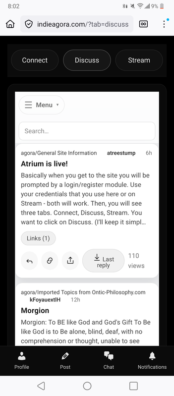
Thank you so much! I do like the main site, it is more impressive looking to me than the prior version even and seems yo run more smoothly also, but those were some notes about my experience and thinking while testing it out on Firefox. I am still using the forum site because of the slight edge that it has for me in navogating quickly to where I want, then I quickly scroll to the bottom of the page where the quick post box is and I get started. Since it is viewable on the main site, it is more useful to me currently than posting from there, since when I do it makes it unavailable here and the whole page that a post from there is on gets that error until I post from the quick box on another page, but if another page isn't available, like lets say page 2 has the error do I can post on page 1, but if it is all on the main page, that thread would be unusable from the forum site.
I didn't test the "Light" button yet.
Ok here is an issue I ran into with that:
https://i.postimg.cc/yYfMh0Rf/1000144013.png
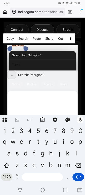
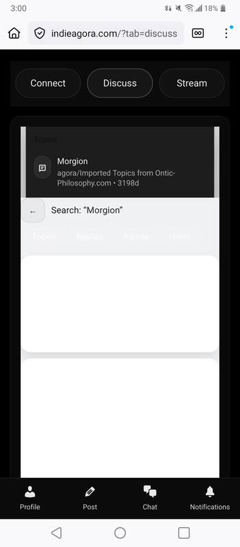
I tested searching "Morgion" in the dark mode and it shows up fine, but in the light mode it just looks blank.
I think I thought the light mode looked fine. I might prefer less squeezing, unless there is a reason for that.
You can compare the squeezing there to here in these two images:
https://i.postimg.cc/kgQx3vyN/1000144014.png
https://i.postimg.cc/CxGjTs4v/1000144015.png
Ideally, for any page and reading experience, even on the narrow screen of my phone which is maybe only two or two and a half or three inches across or something, I'd like as much text readable as possible per vertical inch without eye strain, and it looks like quite a bit of text shows up as it is on the forum site while I'm typing, but recently I've seen some of the text get squeezed, but that doesn't seem to be happening currently as I had seen briefly a little while ago.
Here are some examples of what I'm seeing on both sites currently:
https://i.postimg.cc/Y2X78cKt/1000144017.png
https://i.postimg.cc/wvvfjGWC/1000144018.png
https://i.postimg.cc/C11PxQPh/1000144019.png
Here is wikipedia:
https://i.postimg.cc/B6rV7Cgy/1000144020.png
Pretty limited amount of information per line and per inch sometimes.
Here are some other examples, starting with Google A.I. responding to something (is there a free way to integrate Google A.I. or some kind of A.I. into the main site as well as search results? I wonder if there is a way to comfortably make the site such that I wouldn't even really have to click off as much and can mostly or entirely use one window to get everything done, also look at how disturbingly huge and how much space is taken up by the google keyboard, ehich also often gets in the way of things and has costant glitches:
https://i.postimg.cc/zXBgP1L8/1000144021.png
https://i.postimg.cc/Hsh7qP5g/1000144022.png
I wonder how hard it would be to create a keyboard with a nice amount of storage to access copy pasted things and refer back to them neatly:
https://i.postimg.cc/X7RYcMdL/1000144023.png
That is probably too much of a side thing, but with your skills and the knowledge available out there, I often wonder why people have not been able to make a good competitor to:
Paypal
Patreon
Ebay
Google
YouTube
TikTok (and a replacement of Vine)
Instagram (Stories)
Quora (Yahoo Answers)
Reddit
Facebook
X (Twitter)
Venmo
and whatever else. Why does it always end up being one very dominant thing and experts at programming can't simply make imitations that also make them very wealthy.
I want to have lots of resources so that I can improve ky conditions and help my family as well, but it seems so very difficult and far away to achieve that, evrn with great difficulty, and those difficult methods seem even more futile when one sees people seemingly winning the lottery daily by making jokes on YouTube and getting thousands of dollars through Patreon and ads and "merch" they sell to anonymous people who somehow have lots of superfluous cash they are willing to throw out in honor of these things they fleetingly notice and like before they move on and forget they are paying some random person 10 dollars or more a month sometimes for reasons they might not even recall.
In short, I want to be very rich so that I can continue to exclusively do as little else as possible besides focusing on myself and my interests.
I want to achieve that without even the hard work and study you put in to learning skills and putting your acquired knowledge into action, your energy is extremely admirable to me and that you keep going even through frustrations or minimal initial response or feedback. My way is not one I could reccomend, nor do I admire it or any who might follow it, but I tend to look for the easiest ways to get whatever, ideally with no effort involved or just handed to me or found and no debt or responsibility or even a pressure of thanking anyone for a favor, so if it is just there, without trouble like an obstacle to overcome or competition, and I just have it, like how I was born and taken care of and still try to be as much like a suckling babe as possible.
I want that for everyone else too, even though nothing may seem to function so ideally, but in a world entirely liberated from labor and even effort (maybe possible with a technocracy only after a lot of villainous minds are laid to rest and somehow never allowed to rise again), I wonder what people at leisure always might come up with for themselves.
I believe now, people are headed towards such poverty and exertion that there is less time for thinking about anything, and even their entertainment feels like exhausting work, like staring at constant tragedies or pretty unfunny jokes masking political brainwashing, all of it feels like oppression:
I didn't test the "Light" button yet.
Ok here is an issue I ran into with that:
https://i.postimg.cc/yYfMh0Rf/1000144013.png
I tested searching "Morgion" in the dark mode and it shows up fine, but in the light mode it just looks blank.
I think I thought the light mode looked fine. I might prefer less squeezing, unless there is a reason for that.
You can compare the squeezing there to here in these two images:
https://i.postimg.cc/kgQx3vyN/1000144014.png
https://i.postimg.cc/CxGjTs4v/1000144015.png
Ideally, for any page and reading experience, even on the narrow screen of my phone which is maybe only two or two and a half or three inches across or something, I'd like as much text readable as possible per vertical inch without eye strain, and it looks like quite a bit of text shows up as it is on the forum site while I'm typing, but recently I've seen some of the text get squeezed, but that doesn't seem to be happening currently as I had seen briefly a little while ago.
Here are some examples of what I'm seeing on both sites currently:
https://i.postimg.cc/Y2X78cKt/1000144017.png
https://i.postimg.cc/wvvfjGWC/1000144018.png
https://i.postimg.cc/C11PxQPh/1000144019.png
Here is wikipedia:
https://i.postimg.cc/B6rV7Cgy/1000144020.png
Pretty limited amount of information per line and per inch sometimes.
Here are some other examples, starting with Google A.I. responding to something (is there a free way to integrate Google A.I. or some kind of A.I. into the main site as well as search results? I wonder if there is a way to comfortably make the site such that I wouldn't even really have to click off as much and can mostly or entirely use one window to get everything done, also look at how disturbingly huge and how much space is taken up by the google keyboard, ehich also often gets in the way of things and has costant glitches:
https://i.postimg.cc/zXBgP1L8/1000144021.png
https://i.postimg.cc/Hsh7qP5g/1000144022.png
I wonder how hard it would be to create a keyboard with a nice amount of storage to access copy pasted things and refer back to them neatly:
https://i.postimg.cc/X7RYcMdL/1000144023.png
That is probably too much of a side thing, but with your skills and the knowledge available out there, I often wonder why people have not been able to make a good competitor to:
Paypal
Patreon
Ebay
YouTube
TikTok (and a replacement of Vine)
Instagram (Stories)
Quora (Yahoo Answers)
X (Twitter)
Venmo
and whatever else. Why does it always end up being one very dominant thing and experts at programming can't simply make imitations that also make them very wealthy.
I want to have lots of resources so that I can improve ky conditions and help my family as well, but it seems so very difficult and far away to achieve that, evrn with great difficulty, and those difficult methods seem even more futile when one sees people seemingly winning the lottery daily by making jokes on YouTube and getting thousands of dollars through Patreon and ads and "merch" they sell to anonymous people who somehow have lots of superfluous cash they are willing to throw out in honor of these things they fleetingly notice and like before they move on and forget they are paying some random person 10 dollars or more a month sometimes for reasons they might not even recall.
In short, I want to be very rich so that I can continue to exclusively do as little else as possible besides focusing on myself and my interests.
I want to achieve that without even the hard work and study you put in to learning skills and putting your acquired knowledge into action, your energy is extremely admirable to me and that you keep going even through frustrations or minimal initial response or feedback. My way is not one I could reccomend, nor do I admire it or any who might follow it, but I tend to look for the easiest ways to get whatever, ideally with no effort involved or just handed to me or found and no debt or responsibility or even a pressure of thanking anyone for a favor, so if it is just there, without trouble like an obstacle to overcome or competition, and I just have it, like how I was born and taken care of and still try to be as much like a suckling babe as possible.
I want that for everyone else too, even though nothing may seem to function so ideally, but in a world entirely liberated from labor and even effort (maybe possible with a technocracy only after a lot of villainous minds are laid to rest and somehow never allowed to rise again), I wonder what people at leisure always might come up with for themselves.
I believe now, people are headed towards such poverty and exertion that there is less time for thinking about anything, and even their entertainment feels like exhausting work, like staring at constant tragedies or pretty unfunny jokes masking political brainwashing, all of it feels like oppression:
-
atreestump

- Posts: 924
- Joined: Sun Jun 15, 2025 3:53 pm
Atrium is live!
If you press enter in the search you will see a search results page.
I am trying to widen the screen but there are some limitations.
I am trying to widen the screen but there are some limitations.
-
kFoyauextlH
- Posts: 1983
- Joined: Sun Jun 15, 2025 3:53 pm
Re: Atrium is live!
The image showing the blank area under the search bar was specific to light mode, I pressed enter in a test of the search in both dark and light mode originally, and I tested it again just now, so in dark mode the results have been showing up, in light mode they don't show up, which I think has to do with the setting of the text color for that area, it is likely white text on a white background. I will confirm now by trying to highlight the area to see if there is text there.
Woah, it is far weirder than that lol, those are just blank boxes, and when I try to highlight it reveals a secret dark area underneath the search box, which only has a little space and these big white boxes infront of it and concealing it.
Here is a hint at what it looks like when it is revealed:
https://i.postimg.cc/rsKwcnVy/1000144050.png
https://i.postimg.cc/cCrLZ9xK/1000144051.png
https://i.postimg.cc/brsw8Cyv/1000144045.jpg
Added in 6 minutes 33 seconds:
It isn't too big of a deal overall, it is just something that occurs in the search while in light mode. If you eliminate those white boxes and also turn the result text to look like it is in light mode also, that should be the end of that issue, but it might be a low priority currently if you're working on more important aspects of the layout and buttons.
I'm just mentioning these things in case that it may help in identifying any issues for me or anyone who tries using the site, like if they end up trying the light mode and searching and pressing enter it may look like there are no results, but actually there is a white box in front of the dark text that is still in dark mode for some reason and can't be discovered except by highlighting what is in the search bar and dragging down.
Added in 19 minutes 52 seconds:
This also isn't too important and might not be necessary at all if you don't want to work on compatibility for this forum site with the main site, but it might otherwise be nice if everything shows up between the two along with edits that occur here, though I rarely edit after finding out that the edits hadn't been appearing on the older main site, but if somehow they can show up there too, that might help in the rare cases that I edit typos from the forum site, since you are usually viewing from the main site I think. It isn't too big of a deal these days since I've mainly avoided edits and just keep making new posts.
The ideal experience, which both these sites are pretty close to now in their current states, would be very quick navigation with the most visible information per inch of the screen on a mobile device, the fewest clicks possible, clear and easy to click and hold scrolling bars that don't need to be frequently used and other methods for scrolling down, easy highlightinh, possibly full links, easy saving, easy copy pasting, a quick text box already opened and the entire text on pages revealed so no loads or clicks. An easy way of viewing as many titles and page numbers as possible without lots of scrolling and clicking and ways to reach further pages easily. Everything chronological, a page for latest posts, some or possibly all of these things are already implemented on one or the other site, but ideally both having just about everything and missing nothing and fully compatible between each other. These are just ideas I'm thinking that I might enjoy. If anything is too difficult or irritating for you or aren't compatible eith your preferences you can of course skip them.
Do you navigate and use the sites differently from what I described as my usual method for posting?
Since I'm mainly the one putting up posts regularly during these early days before there are more users, your experience with the site from the background and administrators panel and programmers display area if uou are using those more often might be different, plus you likely have been using a different set of steps for coming up with writing, and most likrly even have a different idea in mind for what you post or may like to see posted or discussed.
In my case, I've been trying to bring up ecclectic collections of odd and disparate seeming, even rare or uncommon pieces of information, ideas, and references, and tying them together to present symbolic and mysterous ideas to stimulate creativity and spiritual, magicsl, and mythical ways of processing and dealing with information like symbols, themes, or just straightforward newsmedia and what people are aldo calling "slop" to give things from pop culture and modernity a deeper coloring and more to it, since there is also a tebdency for many people to push for the opposite, saying things like "it is just a movie" and trying to move people away from giving deeper and weirder meaning to things that are often thought of as silly, mundane, petty, minor, and frivolous.
Added in 1 day 13 minutes 23 seconds:
Cool and interesting changes to the forum site, I wonder ehat the syory behind these might be, if there is any. The forum site might actually seem to be moving faster also, eith faster load times and evrn scrolling somehow.
-
atreestump
- Posts: 924
- Joined: Sun Jun 15, 2025 3:53 pm
Atrium is live!
Ok cool - I am fixing the search results styles in light mode issue now. I will try to fix the error problem you were seeing too - it's whenever someone double posts it conflicts with the merge process in phpbb and there's a clash over how it renders. For now, do not double post on Atrium in Discuss, if you need to add more to a post, use the edit button or use the forum site. I will be rethinking the Stream tab as it is like wrestling. I am going to build my very own video streaming/hosting service but it's going to be a hell of a build and will take some time to be ready. Connect and Discuss are functional enough for the site to be enjoyable. I also impoved the styling of the forum site today so it looks less flat.
Hopefully the error is fixed Artis.
Hopefully the error is fixed Artis.
Last edited by atreestump on Tue Jan 20, 2026 3:18 pm, edited 1 time in total.
-
kFoyauextlH
- Posts: 1983
- Joined: Sun Jun 15, 2025 3:53 pm
Re: Atrium is live!
Thank you! Yes, everything is improved. There was a moment that it showed some text behind the main text that now showed up in the search results, but it wasn't an issue because it showed in front also, and then I couldn't scroll behknd like I was a moment ago, so it seemed like a non-issue even if there is a second layer that shows up behknd under the search bar, now that it also shows up in front where the blank boxes were.
The site is now more readable for me with the text displaying more like it does on the forum site.
I tested typing a podt and going off to retrieve a link and returning and it seemed fine and retained what was in the box when I went to another window.
That was all really quickly fixed, thank you so much.
I don't want to annoy you or distract you with any of these notes on tests and how I navigate and experience the site, so nothing needs to be done about this particular issue, but I noticed I still don't have too much fun navigating to any particular thread there. I'm still able to navigate and see many more threads listed out in the forum version, even with the changes, though the changes are nice looking, there is a bit more looking and more lines and things around that have to be processed, where it seemed in the past version the titles stood out more from everything else and it looked less busy and cluttered, but it also looked less lively and active possibly in that older version too. The big icons on the side with multiple lines, I wonder if those or something similar could be like a little picture that one could put up for their thread, similar to an avatar, which might make it easy to find the threads I want too, when they are the ones that I can edit the first post in and put up the picture for the thread, because then I'd put up the symbols that remind me of the theme of the thread, usually encompassed by a figure or especially a face, like a portrait, usually to do with the title I've chosen. Anyway that is just a fantasy idea, you might not like the look of that either. For example, Morgion would have a little image of something like this: https://2d4chan.org/mediawiki/images/9/ ... Symbol.jpg and so on and so forth. Sometimes it would be a character that is important for me to refer to or recall that has appeared predominantly in a specific thread due to things associated with them, their name, their other qualities, like this character: https://assets.mycast.io/actor_images/a ... 1644851758 in the same thread called Morgion.
If there is anything with picture options, like for a perdonal avatar or an avatar for Agoras (Sub-Forums) or individual threads, anywhere a picture can be loaded, it might also be nice, if it isn't a whole lot of annoying extra work since all these suggestions are not necessary really and are just ideas I thought I might like to see as I haven't seen such elsewhere and wondered what it might be like or if it would help me find threads and be exciting or stimulating somehow to almost anthropomorphize them more and make them seem more like people, objects, and places even, but anyway an auto sizing to fit and also cropping the area one wants displayed feature always seems helpful as compared to sites I've seen where they require the user to already have their images cropped and sized as they like and don't allow any size. I also like when sites are able to save the full quality image and that I can find the origjnsl in various ways like by clicking the dosplayed picture to see it in its full resolution and size and save it, since dometimes I reuse the images in case something happens to them on the site and it csn be difficult to find them again among all the things on my phone.
I noticed my display picture was gone, so I went to where it was visible on the forum site and saved it from there and then uploaded that again as my display picture on the forum site, that was a few days ago now.
Also when I navigate to the main site, it ehows me a page that almost looks like a profile page, rather than immediately showing me the pages with recent posts or the agoras, so I noticed that I end up clicking through a lot and multiple clicks and that it isn't as breezy and quick as my navigation experience here on the forum site, where I type "f" in the address bar, the link comes up, it takes me to the list of Agoras or sub-forums and I click the Ontical one usually which has the threads that I update the most, and it lists a lot that I can see at once, and I find the one I want, click it and scroll to the bottom of the page where the quick reply box is. I noticed I tried to follow the same steps but scrolling down to the bottom once I selected a thread just led to a load more button, and I scrolled back up to open up the post reply button, but I could have aldo clicked the reply button at the bottom of each post. I liked that the reading and the way things were displsyed didn't look too bad, but I'm still preferring it here on the forum site.
These are not meant to frustrate you or be overly critical or anything as both sites look very impressive to me and of tremendously high quality work which you've done with incredible dpeed, possibly the most impressive high-speed programming work while doing other things during the day, that I've ever seen. These are just notes in case that they might help based on one sort of not too technology savvy person using each site.
So there has been a slight decrease in the speed with which I can find a thread on the forum site since the visual change, possibly tdue to a reduction in color differences, a little more going on for the eyes, a little more that might complicate finding things, but I don't mind terribly and I thought the change was interesting and mentally stimulating and maybe it helps, like how my apartment is currently a mess and I have boxes everywhere that have to be dodged or else one might really fly and die fantastically.
-
kFoyauextlH
- Posts: 1983
- Joined: Sun Jun 15, 2025 3:53 pm
Re: Atrium is live!
I've turned off my battery saver program that slowed down the frame rate and reduced the various effects on the phone, so now I'm viewing things with all those things turned on to see if that might make any difference. So far all it appears to be doing is moving really fast when I scroll and stuff, load times might be just a little slower in some cases if more is being loaded and dealt with.
-
atreestump
- Posts: 924
- Joined: Sun Jun 15, 2025 3:53 pm
Atrium is live!
Do you like the 0 replies, random and forward and back buttons?