Page 1 of 2
Atrium is (mostly) complete
Posted: Sun Feb 01, 2026 7:44 am
by atreestump
For the most part, Atrium is now complete.
We now have:
Connect with most basic functions (ability to share, follow block etc)
Discuss is very near complete in terms of functionality.
Chat works for the most part now.
The post function works.
Notifications are finally working (just needs snagging today)
Stream shows read only - will be rebuilt soon to suit Atrium's architecture.
It's mostly a matter of small bugs and cosmetic changes now with future upgrades.
With this in mind, I want to let users who use the forum site over at forum.indieagora.com know that I am looking to decommision the phpBB site in the coming months. Please begin to use Atrium more so that you can get used to it. All of your content from there will be here on Atrium.
I will provide a final decommision date soon, still lots of things to get in order here but for the most part, Atrium has all of the structure it needs in place now.
Re: Atrium is (mostly) complete
Posted: Wed Feb 04, 2026 11:22 pm
by kFoyauextlH
The decomossioning of this forum site that I am using yo make most of my posts currently would not be a tragedy or issue if you are able to somehow make a view mode that can be toggled on the main site and stays on for an account when selected, which makes the site viewable in the same way that this site is or even better.
Some of the things I like and use about this forum site are how easy it is for me to navigate to where I want eith very few clicks overall, how light colored it is snd domehow easier on my eyes that way without being a very stark contrast that might be less easy on the eyes than the color schrme here. How the titles pop out but are also minimal and many more are visible per page. How I can access the Forum sections and dub-forums very quickly, typically switching between two and mainly using the Ontic Archive one where my 33 renamed threads are.
I like that there are no load mores with scrolling, I like that the editor box is available at the bottom and already opened so that I can immediately be typing in it and scroll up and read and copy things from above without the other posts being dimmed and without clicking off or anywhere evrn on accident causing the text box to disappear, it is very stable seeming, aldo my writing seems to save and be preserved in case it reloads or I accidentally travel away from the page, but if that isn't do, that feature aldo helps, so that even if I reload a page where I have been typing, it has saved my writing before it was posted ehile it was bring tyoed, and that it saves constantly and without delays since my posts grow rapidly and I wouldn't want parts to be missing if it didn't save new additions in the text box fast enough.
So if you are able to basically just port over a version of all this there then I wouldn't need this site or feel as attached to it or afraid about the other one.
Over there, though I like how the new site looks a lot and I'm very impressed with the work you've done and how quickly and expertly you put it all together and how superior it looks even to the former version which had also been impressive, the way it is currently would not be as fun for me to move through or read things in, even if that was the only version I was ever exposed to it would have really caused me enough discomfort that I'd likely not has posted anywhere nearly as much as I have on the forum site in a relatively short amount of time even while experiencing distressing things like that sickness when I wasn't feeling well.
I like the text buttons that write out what they do, I like the small text and being able to read and see a lot more in a post without scrolling. Ideally I would like things easier to click, very secure and stable so that I don't ferl efforts are at risk of being lost, very few clicks and scrolling overall, forum areas, sub-forums, threads all very visible and easy to see in as few glances, scrolls, or clicks as possible.
I don't like that the original post of a thread shows up and that text takes up a lot of space. I like when I can see all the threads listed like I do here, at least a lot more, and I can scan and click the one I am looking for and I don't see the first post sample text over and over as I'm looking through and it makes scrolling longer, then load, and that eould go one for a very long time in the Ontic sub-forum because of how many threads are in there.
My phone just slipped slightly just now and caused me to click off, I thought I might have lost all this writing, but I clicked back and here it all was, saved and preserved, which was a relief, but I fear that would not have been the case if I clicked anywhere accidentally and caused the reply box to disappear on the main site.
So I have a lot of fun seeing more on this forum site, I quickly see the sub forums choose which one I want to enter, I see all the threads listed and how they keep moving up, and when I click a thread, it is easy for me to reach the already embedded and opened quick reply box which I use.
I would also like the post length to be very long but also not to lose any of my writing if it is too long for some reason, so that I can use my usual method of then trying to copy a portion of the text and post the remaining text to see if that fits, but giving an ability yo post very long posts would likely reduce the necessity of that and I have not been running into it often here or evrn there, as one recent post I feared might be long on the main site and I worried that it might lose the text or a portion of it or fail to post if it had exceeded a limit, but it seemed to be fine.
I zoom through the forum site, I can see which threads are being neglected by how they are far back but I can reach them easily, it would be extremely difficult to reach these left behind posts with the scroll and load more and seeing Jimmy Saville's mug repeatedly in the process and getting bombarded with impossible to avoid or ignore extra text from the original posts of numerous threads.
I also am not too fond of there not being a way to click a thread from the outdide to go immediately to the latest post somehow, any extra clicking or thinking how to navigate or do things because of it not being written out or more obvious can make it a little more tiring feeling and depletes what little energy and enthusiasm I may have for whatever I'm thinking to post, and I notice that I am able to maintain my interest and feeling to collect or share something much more on the forum site so far because of how easy it is for me to see everything, how few clicks to get to where I want, no excess information or looking through lots to get to where I want or back to an area, I can get to collecting the information in a post much more quickly and with less concern that I may accidentally lose all of that and have to start all over.
So if it isn't too much trouble, if you can make a viewing experience more similar to this site or accomodating for these issues, I would much appreciate it and be able yo continue as I have been without feeling like a lot more obstacles have been placed before me for my preferences and style of viewing and posting rapidly, and even the light and relaxing palette without any stark black around seems to help me to post in different lighting conditions, like right now I'm posting in a dark room, other times the lights are on and show up behind my phone but the light version of the forum site seems to not cause as much eye strain for me for some reason.
Atrium is (mostly) complete
Posted: Thu Feb 05, 2026 5:13 am
by atreestump
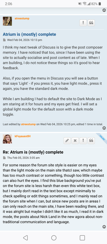
I think my next tweak of Discuss is to give the post composer memory. I have noticed that too, since I have been using the site to actually socialise and post content as of late. When I am building, I do not notice these things so it's good to hear feedback.
Also, if you open the menu in Discuss you will see a button that says 'Light' - if you press it, you have light mode., press it again, you have the standard dark mode.
While I am building I had to default the site to Dark Mode as I am staring at it for hours and my eyes get fried. I will set a global light mode for the default soon with a dark mode toggle.
Re: Atrium is (mostly) complete
Posted: Thu Feb 05, 2026 10:05 am
by kFoyauextlH
For some reason the forum site style is easier on my eyes than the light mode on the main site thatcI saw, which maybe has too much contrast or something, though too little contrast can also hurt the eyes. I find this blue background you've put on the forum site is less harsh than even this white text box, but I mainly don't read in the text box except minimally to check spelling or edit things sometimes, and I mainly read on the forum site when I can, but since new posts are in areas I can only reach on the main site, I have been reading there, and it was alright but maybe I didn't like it as much, I read it in dark mode, the posts about Nick Land in the new agora about non-traditional communication and language.
Re: Atrium is (mostly) complete
Posted: Thu Feb 05, 2026 10:16 am
by kFoyauextlH
Two blues, The Blues Brothers:
https://i.postimg.cc/MGYMX88d/1000145146.png
I'm not totally sure but maybe the darker blue is easier on my eyes but both seem fine and both seem better than the very dark or very light backgrounds on the main site, and the purple or whatever color link on the dark background in the chat area was very difficult to see and read, so that hurt to try to see what it said and I never ended up being able to either, whatever that link was back when I mentioned that.
I went out today and I'm in a crazy amount of physical pain in my chest from costochondritis I think, it is just hurting by itself without my moving around even as I lay here, but usually it acts up with walking or any kind of repeated motions and then it really hurts in the chest area, even though it is radiating from the back and ribs supposedly. It really sucks, among numerous things that sadden and annoy me these days, all these problems that gradually built up since 2017 or 2016 where they may have started to emerge originally. I have a thing that is supposed to help with it, though I'm not sure how much it does, but it is currently buried under a mess of things here, some of which I cleaned up today which I'm happy about, but there is a lot for me to do here and one month has already past.
Atrium is (mostly) complete
Posted: Thu Feb 05, 2026 2:15 pm
by deleted user
Hi, just something I miss from other forums, the ability to hyperlink text.
Re: Atrium is (mostly) complete
Posted: Thu Feb 05, 2026 8:07 pm
by kFoyauextlH
If you think of other things too, please feel free to mention them to see if you can get everything you would enjoy and which eould make your experience the most enjoyable on this site, as it is built from the ground up and I think that it is very possible to get it designed in a way that could feature everything we each consider ideal for our preferences and uses.
Re: Atrium is (mostly) complete
Posted: Thu Feb 05, 2026 10:00 pm
by kFoyauextlH
So, I was just at the main site a moment ago, and I noticed how I get excited with the way that this forum site gives an indication of new posts by highlighting unread things in the list which shows more. On the main site currently it doesn't give any signal like that as far as I am aware, except for moving something up to the top of the feed, and the information the feed provides is the snippet of the first post in the bumped thread which I automatically end up reading slightly each time.
So I thought, even though I don't like that and would prefer an area that I can view it differently than that, if there is going yo be this lengthy snippet version, maybe there could be a snippet of the latest post and whoever made it also included, as that is more interesting information for me, plus there can be a little indicator to let me know what is new and what I have read or checked into or if it is something else that has been added since.
It might nut be useful on the main site, but I remember enjoying on some medium to parge sites seeing a symbol that indicated a thread is popular or very active or very big by having different dymbols for those pike badges, like a fire symbol seeming to indicate the thread is "on fire".
There were a lot of little gimmicks from the old internet that I found cute and funny, maybe even "cheeky" and "cheesy" , which I enjoyed.
The way that the feed displays on the main site not only diesn't provide me with too much information of interest and feels like it repeats too much that quickly becomes possibly a little annoying to see repeatedly, but also makes it very difficult to find topics of interest, that may be futrther on but difficult to reach in this very linear scrolling fashion, and even though I may know the threads, after a while in which they are neglected, they feel new again or like they should be brought back up or used more, but if there is no easy way for me to view them and I'd gave to memorize their names in the hope that they will show up in the search results, that is scary for me, so I will as a precaution be saving all the titles in a notepad on my phone if I can, but it would be much better if there is eventually a way in which I can access the titles much more easily and view more and see the threads which are way back too, with clickable links to them.
There could even be a view where all the threads are listed or visible, possibly even in multiple columns but without other separation like putting the entire forum's topics in a olace I can scan through and see the title, the creator, if anything is new or unread or if I haven't read it yet, how many posts are in it, date of the first post of creation and date of the latest post, date of the latest edit and by who. Other interesting information could be somewhere else if this is too much, but it could include how popular the thread is, the period which it was most frequently updated or a chart that shows a timeline of activity, haha, these are not important or necessary or anything, but just the kinds of ingormation I sometimes find information like a graph or whatever showing activity in 2017 then a long dead period and then a jump during certain months more recently. It woild be cool, but all this may be too irritating to implement, I'm just fantasizing for now, but to be able to click those areas dhowing the frequent posting or most posting would take me to those posts or that period in the thread. I definitely would like quick ways to see as much information as possible in any thread once I enter the thread, and also to be able to see much more without lots of scrolling through narrowness that has less text. It might be nice if there is a way for me to zoom in or out so that I can read more abd aldo navigate through long threads more quickly vto see areas and then go closer to those or to focus on those posts even if zoomed way out I can't read the text but maybe could still see the video thumbnails somewhat and would get an idea of where I may be in the thread or see something of interest.
On the forum site I am able to zoom in but not out, the same as on the main site.
I'd like any new visitors to be able to see as much as they can as immediately as they can in case something that would have otherwise been hidden further back and require lots of scrolling and loading is much more available in case that might be of interest to thrm as compared to whatever might just be bumped recently which they might not care about but they may think we are all about that or don't have so much more.
In the light mode, I just saw that you may have added a salmon coloring behind the text which I hadn't seen before somehow, and I am liking that, it immediately made it easier on my eyes as compared to haraher contrast, similar to how the blue here on the forum site seems to help while the light colors keep my mood up, as silly as that may sound, I think there is something to it for people and that evrn these little, almost superstitious things, have a real psychological impact.
Re: Atrium is (mostly) complete
Posted: Thu Feb 05, 2026 10:59 pm
by kFoyauextlH
Ok, so the biggest agora or sub-forum, the Ontic Archive that I have been using the most, takes 16 load more clicks to reach the end, not that different from the 14 pages of the version on the forum site, except that I have to vertically scroll through the text snippets and it only shows me two titles at most at a time, as compared to the 13 I see at a time in the forum version, with 25 total if I count only those together and exclude the two extra separated in the Announcements sub-category or partition at the top of the page.
There are 13 pages with the full 25, for 325 threads, plus the final page which has 6 more for 331, and then those two extra under announcements which show up at the top of each page, for 333 (and I have 33 renamed threads).
30 threads in the next most used area.
Creative Writing was probably a fine section but seeing it separated out, my tendency would have the thread that is in there to be absorbed into the area with 30 probably, but now on the main site there can be so many agoras that there being that section shouldn't matter and it will likely gtow at some point if we get more sctivity or we end up using it for more threads once I get less shy about creating new threads, since currentoy I've been almost exclusively trying not to make new threads but only yo use the ones that I have and those which I don't make, since I feel that I have so many that I made already in 2017 and one more recently in the section with 30 threads, that I feel I should have more than enough space for now to use for collecting and covering lots of ideas.
I have 1 out of the 30 threads, and 1 weird one that is my writing but posted by someone else out of the 331, and 70 or 71 or something out of the 331 are made by me, with 33 that are renamed in that section, maybe only 2 new threads, possibly three new threads that I created since 2017. It was difficult for me to count all those since there was no information on the forum site as to eho created the post until I clicked, but mainly I could tell based on the titles, but multiple times I had to question if I made certain threads that ended up having been made by Socrates, so that was interesting that there was enough similarity that I was clicking multiple Socrates threads or topic choices, but minecare still typically a little more weird and probably intended to collect more things overall or to be exhaustive in whatever it is collecting.
There are also a few threads which I did not create which I've been using so extensively and frequently that I consider them like locations on my frequently traversed map of the site too, like Grenfell Tower, which is my version on the map is a haunted and ruined tower, which I suppose is what that probably is in this world too. It connects in some ways to impressions I get from some if my own threads like Morgion and Lord Soth, and maybe even Zariel and Belzenlok, which each overlap with others or have connections to others that make each unique combinations, for example Zariel has ties to Yeenoghu and Yeenoghu had ties to Hruggek but Hruggek does not have the same areas or aspects linking to Zariel, if at all, and these connections sometimes are made clearer to me through images I associate with the titles and what they are meant to refer to.
That whole map scheme and feeling has been, hopefully temporarily, disrupted by the layout of the older main site and this latest main site, but is much more present for me on the forum style site by the way that I can view more titles at once and how they look when bumped and how the layout and view works in my imagination as compared to the more linear seeming scroll version, the best or most enjoyable aspect of which has been the images that sometimes show up at the top of the snippets, except for Jimmy Saville's mug. Those images help me to very quickly remember what thread that is, without reading.
Re: Atrium is (mostly) complete
Posted: Tue Feb 10, 2026 9:46 pm
by kFoyauextlH
Is there anything on the site where instead of chronologically saving all posts, it saved every thread and all posts in the thread in order? Or just for one user.